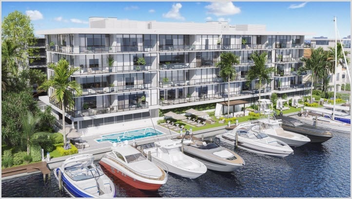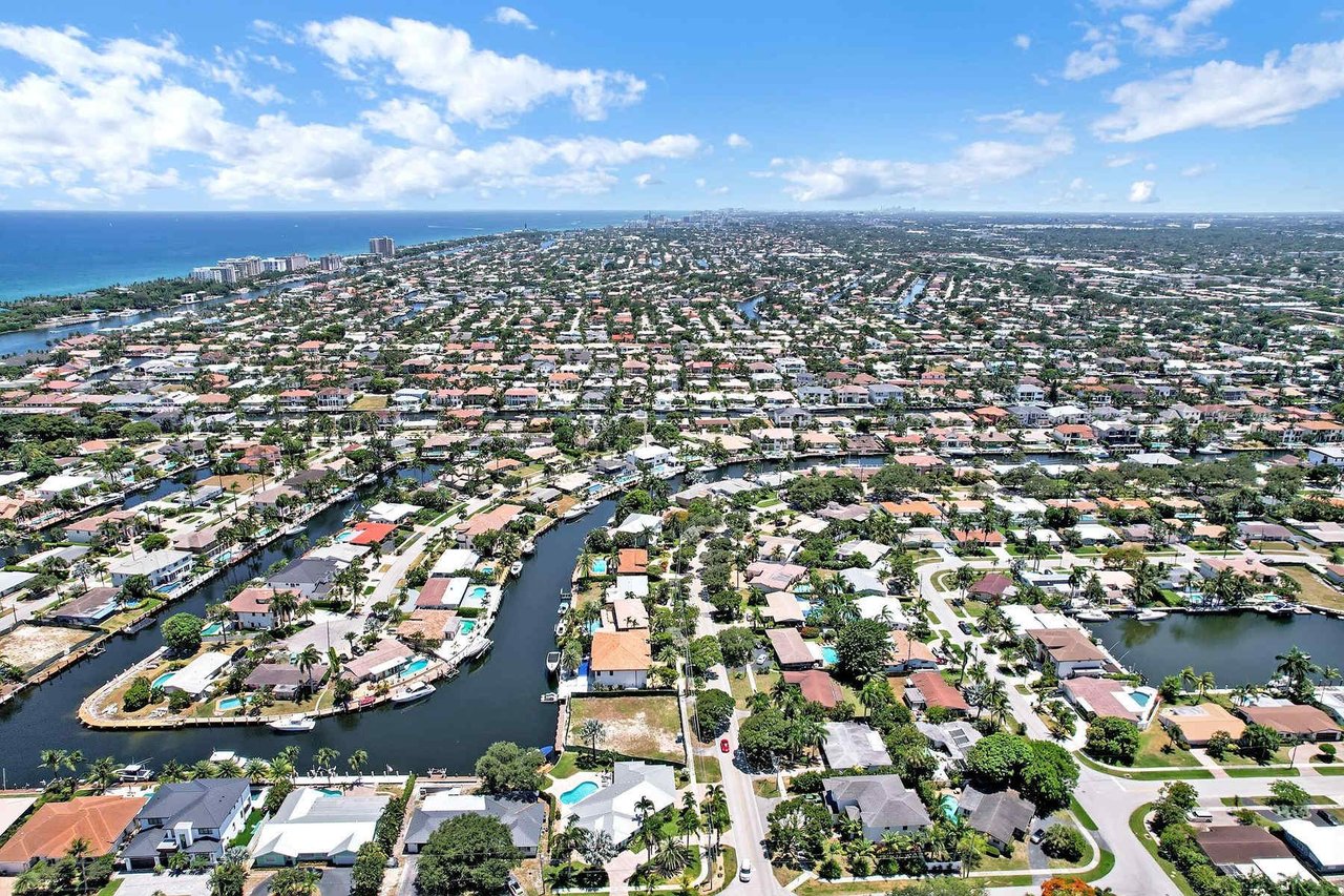
South Florida is a market built on light, water, and lifestyle. From bright coastal towns to luxury high-rises and historic neighborhoods, paint colors here need to do more than look beautiful they need to breathe with the light, enhance indoor-outdoor living, and stand up to a humid, radiant climate.
Here’s what’s trending in 2026 and why these palettes are especially right for South Florida.
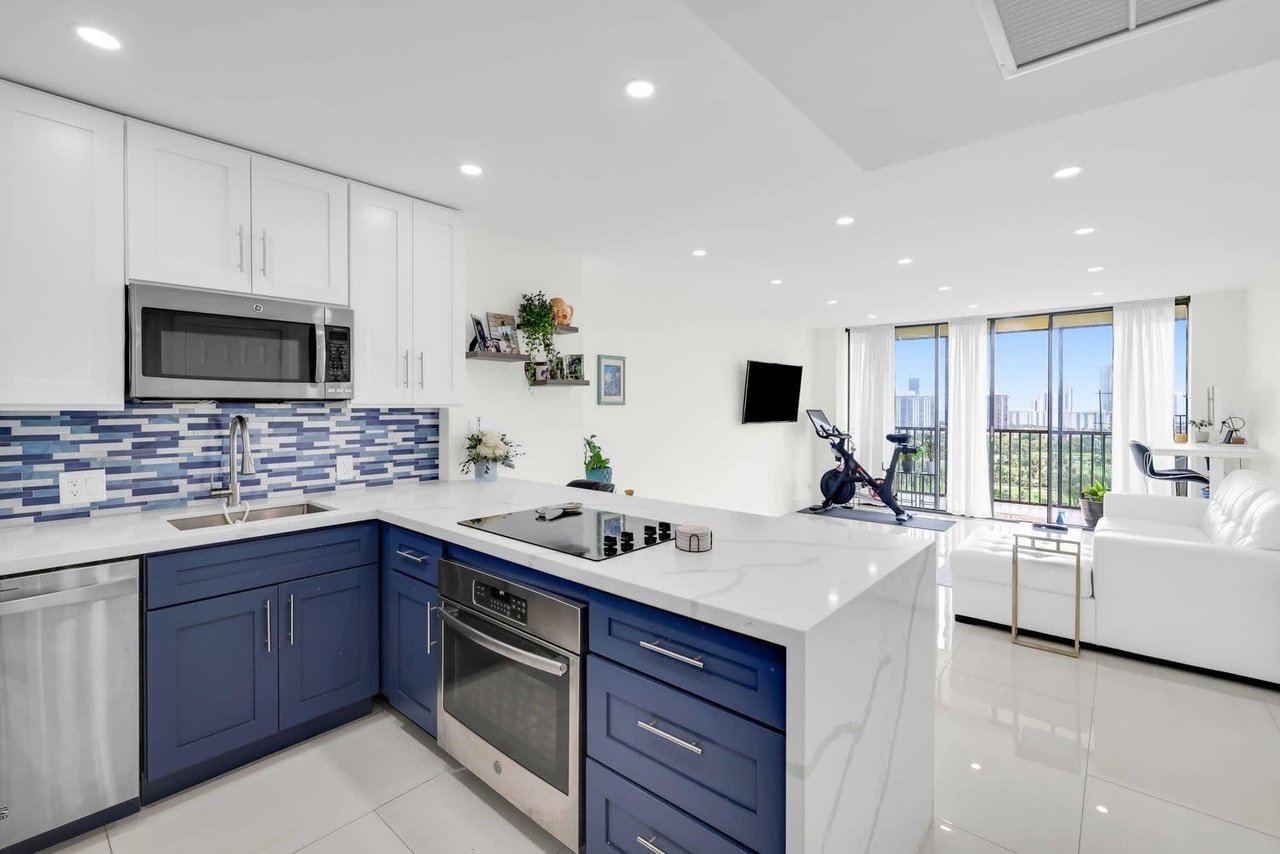
☀️ 1. Coastal Neutrals with Warmth
In South Florida, light reflects differently especially near the water, and paints that read too cool can feel flat. The 2026 neutral trend here leans into warm, sandy undertones that soften light and make spaces feel inviting.
Trending hues include:
-
Warm cream and beach sand
-
Muted taupe with golden undertones
-
Soft greige with peach-leaning warmth
These colors feel at home beside white trim, natural rattan, light wood tones, and stone — all staples of South Florida interiors.
Why it works here:
Reflects sunlight without glare and feels perfectly at ease with indoor-outdoor spaces and breezy airflow.
🌴 2. Subtle Coastal Greens & Blue-Greys
South Florida buyers love color, but overly saturated paints can feel overwhelming in bright light. The 2026 trend here is soft coastal hues greens and blue-greys inspired by:
-
Sea foam
-
Sea oats
-
Early-morning sky
These are calming, adaptable, and pair beautifully with textures like linen, wicker, and driftwood.
Why it works here:
These hues create a seamless transition between interior and exterior spaces — especially in condos and homes with water views.
🔥 3. Heat-Resistant Earthy Tones
With humidity and strong sunshine year-round, earth tones with slightly warmer undertones are gaining traction in 2026 for both exterior and interior use:
-
Terracotta taupe
-
Driftwood brown
-
Warm clay and ochre variants
Used as accent walls or paired with crisp white trim, these shades add life without clashing with South Florida’s vibrant backdrop.
Why it works here:
These tones mask shadow and shine variations common in open floor plans and outdoor living areas.
🌆 4. Moody Accent Hues Balanced with Bright Light
Moody jewel tones like deeper blues, charcoal greens, and muted teal are trending for accent walls in 2026, but in South Florida they’re used strategically: narrow corridors, home offices, dining rooms, or feature walls with lots of natural light.
This trend is about balance grounding a space without making it feel smaller under bright, all-day light.
Why it works here:
South Florida’s abundant natural light can handle richer hues they won’t feel heavy like they might in northern climates.
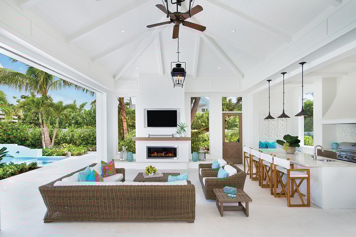
🛋️ Local Style Tips for South Florida Buyers & Sellers
🔹 Light + Bright Is Still Paramount
Even trending accent tones should be paired with reflective, light-enhancing neutrals to make spaces feel open and expansive — especially during showings or photography.
🔹 Consider Outdoor-Friendly Complements
South Florida homes often blur interior and exterior spaces:
-
Light neutral walls transition beautifully to patios and lanais
-
Green-leaning hues echo outdoor landscaping
-
Subtle terracotta or warm tan plays well with poolside tile and decking
🔹 Exterior Colors Matter Here Too
Because of the sun and coastal context:
-
Exterior whites with warm undertones tend to look more cohesive with the surrounding landscape than stark cool whites
-
Soft beige, oyster shell, and cream variants show fewer oxidation and brightness issues over time
🌟 Why These Trends Matter for Your Home
Whether you’re selling or remodeling, paint choices in South Florida aren’t just aesthetic — they influence how buyers feel in a space. They can:
-
Make rooms feel larger and more cohesive under bright sunshine
-
Create flow between indoor and outdoor spaces
-
Complement water views, lush landscaping, and coastal architecture
-
Show well in listing photography and virtual tours
🎯 Pro Tips for 2026 South Florida Homes
-
Use warm neutrals as your foundation they adapt to shifting sunlight and interior styles
-
Add subtle coastal greens or blues in spaces where you want serenity
-
Use rich, moody accents sparingly only where natural light supports them
-
Tie interior colors to exterior environments (landscape, water views, patios)